CSS примитивы
Квадрат

#square {
	width: 100px;
	height: 100px;
	background: red;
}
Прямоугольник

#rectangle {
	width: 200px;
	height: 100px;
	background: red;
}
Круг
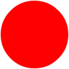
#circle {
	width: 100px;
	height: 100px;
	background: red;
	-moz-border-radius: 50px;
	-webkit-border-radius: 50px;
	border-radius: 50px;
}
Овал

#oval {
	width: 200px;
	height: 100px;
	background: red;
	-moz-border-radius: 100px / 50px;
	-webkit-border-radius: 100px / 50px;
	border-radius: 100px / 50px;
}
Треугольник вверх
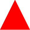
#triangle-up {
	width: 0;
	height: 0;
	border-left: 50px solid transparent;
	border-right: 50px solid transparent;
	border-bottom: 100px solid red;
}
Треугольник вниз

#triangle-down {
	width: 0;
	height: 0;
	border-left: 50px solid transparent;
	border-right: 50px solid transparent;
	border-top: 100px solid red;
}
Треугольник налево

#triangle-left {
	width: 0;
	height: 0;
	border-top: 50px solid transparent;
	border-right: 100px solid red;
	border-bottom: 50px solid transparent;
}
Треугольник направо

#triangle-right {
	width: 0;
	height: 0;
	border-top: 50px solid transparent;
	border-left: 100px solid red;
	border-bottom: 50px solid transparent;
}
Треугольник в левом верхнем углу

#triangle-topleft {
	width: 0;
	height: 0;
	border-top: 100px solid red;
	border-right: 100px solid transparent;
}
Треугольник в правом верхнем углу

#triangle-topright {
	width: 0;
	height: 0;
	border-top: 100px solid red;
	border-left: 100px solid transparent;

}
Треугольник в левом нижнем углу

#triangle-bottomleft {
	width: 0;
	height: 0;
	border-bottom: 100px solid red;
	border-right: 100px solid transparent;
}
Треугольник в правом нижнем углу

#triangle-bottomright {
	width: 0;
	height: 0;
	border-bottom: 100px solid red;
	border-left: 100px solid transparent;
}
Параллелограмм

#parallelogram {
	width: 150px;
	height: 100px;
	-webkit-transform: skew(20deg);
	   -moz-transform: skew(20deg);
	     -o-transform: skew(20deg);
	background: red;
}
Трапеция

#trapezoid {
	border-bottom: 100px solid red;
	border-left: 50px solid transparent;
	border-right: 50px solid transparent;
	height: 0;
	width: 100px;
}